macOS Tahoe beta 2 swaps Finder icon colors back after historic design fumble
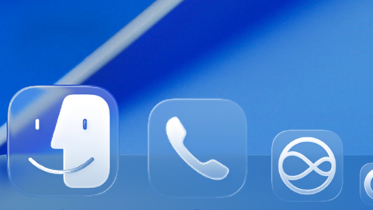
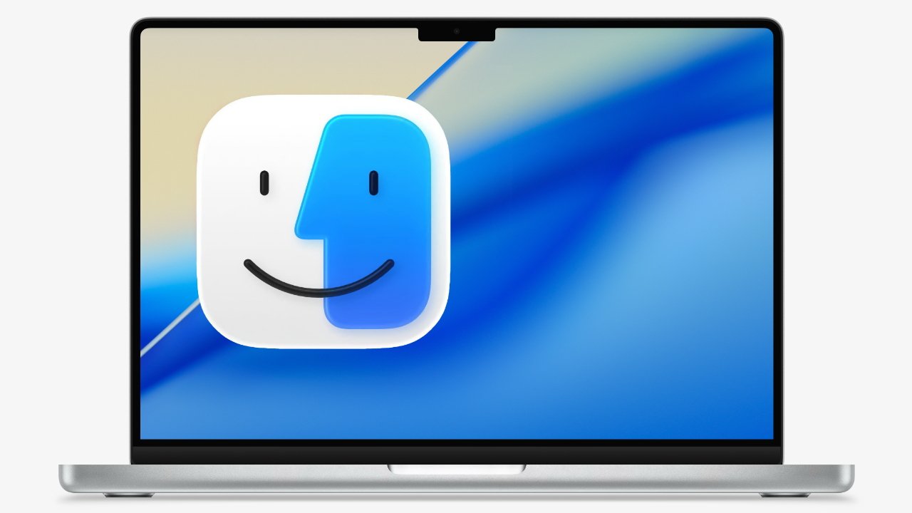
When Apple initially announced macOS Tahoe 26, it showed a redesigned Finder icon that moved the blue color to the right side, which went against nearly 30 years of history. Monday's beta fixes that.
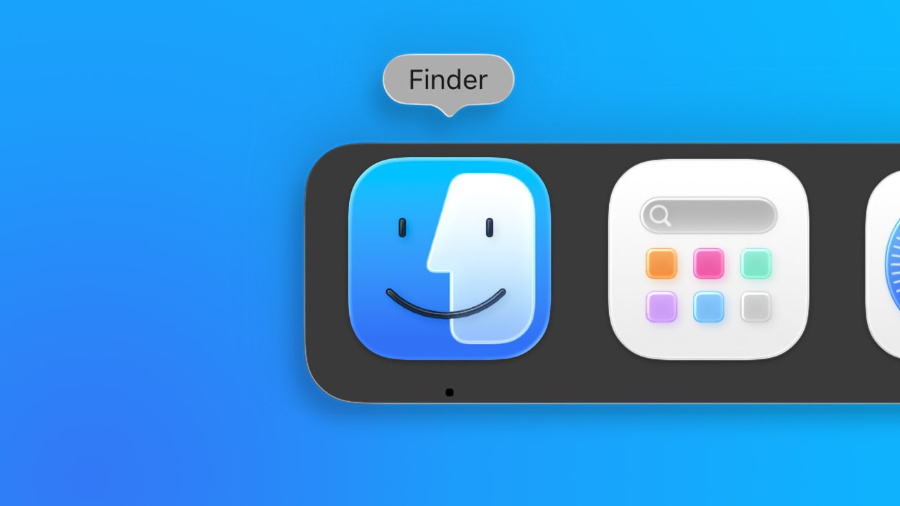
Finder's original color scheme has been restored in macOS Tahoe
Apple's attention to detail has widely been regarded as near-perfect, at least in terms of design. However, there are moments when the need to introduce something new for the sake of new wins out.
As Stephen Hackett, 512 Pixels writer, Apple history buff, and cofounder of Relay.fm podcasting network pointed out, the swapped color scheme in the macOS Tahoe 26 Finder icon was an abrupt departure from history. The darker color has always been on the left side of the Finder icon.
Continue Reading on AppleInsider | Discuss on our Forums