Apple hasn't updated the
Apple TV 4K since 2022, and 2025 was supposed to be the year that we got a refresh. There were rumors suggesting Apple would release the new Apple TV before the end of 2025, but it looks like that's not going to happen now.
Bloomberg's
Mark Gurman said several times
across 2024 and
2025 that Apple would update both the
HomePod mini and the Apple TV 4K toward the end of the year, and we also
heard the same information from other sources. No announcement happened in September alongside the
iPhone launch, and when Apple updated the Vision Pro,
iPad Pro, and
MacBook Pro in October, there was no sign of the Apple TV.
It's not clear what happened, but it's possible Apple decided to hold all home-related product announcements until spring 2026, when the smarter, more capable version of
Siri will be ready in iOS 26.4.
That's right around the time when Apple is rumored to be launching its new home hub device, so we could see the Apple TV, home hub, and HomePod mini sometime in late March or April.
Rumored Features
The Apple TV isn't going to get a major design overhaul, but there are some useful updates in store. It's long overdue for a new chip, and Apple's newer chip options will bring gaming improvements.
A-Series Chip
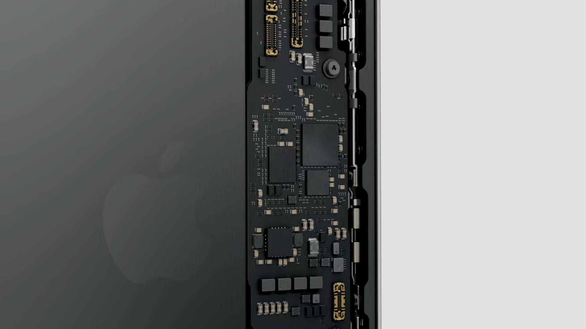
The next-generation Apple TV is expected to get an updated A-series chip, and Apple backend code we found suggests that it'll use the A17 Pro. The A17 Pro is the chip that Apple first used in the iPhone 15 Pro models, and it would bring
Apple Intelligence support to the Apple TV for the first time. The A17 Pro is built on 3-nanometer technology and it would also bring support for console-quality games thanks to much improved CPU and GPU performance. It'll be a significant improvement over the current A15 Bionic chip.
N1 Chip
Apple debuted its custom N1 networking chip in the
iPhone 17 models, and rumors suggest that the N1 will also be used in the upcoming Apple TV. It adds support for Wi-Fi 7, which is not a current Apple TV feature. With Wi-Fi 7 support, the Apple TV will be able to connect to Wi-Fi networks that support the faster and less crowded 6GHz band. Users can expect faster Wi-Fi speeds and lower latency.
New Siri Features
With a faster chip that supports Apple Intelligence, the next-generation Apple TV will support the LLM version of Siri coming in 2026. Siri will be more like Claude or ChatGPT, which could lead to better Apple TV recommendations, the option to use voice commands to do more than before, better support for questions about actors and music in movies and shows, and much more.
Pricing
There's a possibility that Apple will cut costs for the next Apple TV, and Apple analyst
Ming-Chi Kuo has suggested that Apple is targeting a price point around $100. With the A17 Pro chip and the N1 chip, Apple might not be able to hit that price with the flagship model, but there could be a lower-end entry-level option that's more affordable. Pricing right now starts at $129.
New Launch Date
In early November, Gurman said that an Apple TV and HomePod mini "shouldn't be too far off" based on dwindling supplies of the devices at Apple retail stores. At the time, he said a post-2025 debut was a possibility, but he confirmed the products are ready to go and could launch at any time.
The HomePod mini and Apple TV will "help showcase the new Siri and Apple Intelligence features" that Apple has coming, which makes the spring timing sound even more likely.
This article, "
Where's the New Apple TV?" first appeared on
MacRumors.comDiscuss this article in our forums


 Note: MacRumors is an affiliate partner with Amazon. When you click a link and make a purchase, we may receive a small payment, which helps us keep the site running.